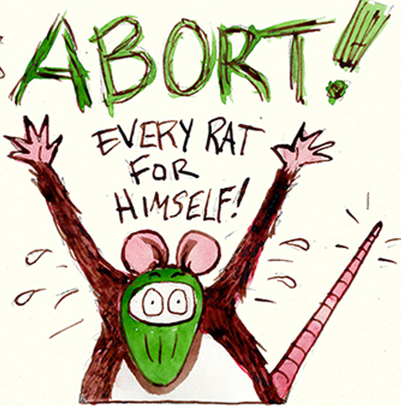
Each panel of GONOGO is a hand painted watercolor that is scanned into the computer, with the final comic assembled in Photoshop. The results a kinda wonky at times, but that is a feature not a bug. I dont even use black ink, I use a dark brown for the outlines. (Winsor & Newton Nut Brown, to be precise) It is a far more labor intensive process than what many “Webcomics” artists do. I hope that it’s wonkyness conveys as a “handmade” look and not a lack of skill (although I am increasing my skill in every comic I make) This choice, of course, has consequences. The new format for webcomics is that they are being read on phones and not PC screens. Many webcomics capitalize on this and abandon the left-to-right-page format in favor of a vertical scroll. Although this looks great on a phone, I just cant seem to wrap my head around how this format would look printed. And yes, I realize that it may never be printed (a kid can dream, cant he?) but I feel like abandoning the format that we all grew up with to accommodate a platform that has only been around for about a decade is not “on brand” for GONOGO.
I am not such a luddite that I am against using photoshop wizardry when needed. In this weeks comic I needed to depict the rats in the dark, so instead of doing a very risky watercolor wash over the finished artwork, I simply applied a blue/purple gradient in Photoshop. The result does have a more “digital” look than the rest of the comic, but I just chalk that up to the director using “special effects” to tell the story.
